
Purely Heartfelt
where nature meets brand design
The Seeds of Inspiration
Every brand begins with a moment of clarity. For Purely Heartfelt, that moment emerged from the intersection of photography, mindfulness, and the profound beauty of life’s celebrations. As a photographer, brand designer, and holistic harmony coach, I’ve learned that the most powerful stories emerge not from what you add but from what you allow to unfold naturally.
The Brand:
Purely Heartfelt
Project:
Full brand design package
Keywords:
harmony, intuition, uncompromised, highly creative, personal, modern, innovative, sophisticated, highlighting nature’s wisdom
Brand Photography:
Nikki Harris Photography
The Philosophy Behind the Name
deep roots…
authenticity cannot be manufactured – it must be discovered
The name “Purely Heartfelt” emerged from a fundamental truth about meaningful design: authenticity cannot be manufactured – it must be discovered. Like a photographer waiting for the perfect moment when light, subject, and emotion align, the name captures three essential elements of transformative brand design:
Pure
The unfiltered authenticity that emerges when we strip away pretense
Heart
The emotional core that connects us to our purpose and our clients
Felt
The tangible impact of work that resonates beyond the visual
Natural Evolution: The Visual Language
Just as nature never uses color merely for decoration, each element of the Purely Heartfelt brand was chosen for its deeper significance
Color Palette: A Symphony of Natural Wisdom
Soft cream tones
Evoke timeless emotions and create space for authenticity
Charcoal with green undertones
Grounds the brand in sophistication while maintaining a connection to nature
Warm light green
Represents growth and the wisdom found in natural systems
Bold terracotta
Adds warmth and nurturing energy, bridging tradition with contemporary style
Beyond a decoration
Exploring the unconventional, expanding the limits, unfolding my imagination. The foundation is foundational, but daring to go beyond and opening your perspective to weave into creating without limitations. In my photography art, I ask questions, invite the viewer to deepen their thoughts and dare to see things from a different perspective… which is the growth, expansion, and unfolding of one’s being. So, why not use this when creating and developing a brand design? Most see colors, fonts, and forms mainly as decorations only. But have you seen nature? Nature never uses color or form just so. It’s about meaning, harmony, and creation.
The Mood Board
Like a perfect sunset painting the sky in harmonious hues, each color in the Purely Heartfelt palette tells its own story while contributing to greater harmony.
The soft cream tones create a canvas of timeless elegance like morning light filtering through gossamer clouds. The charcoal with gentle green undertones grounds in sophistication while whispering of forest depths and ancient wisdom.
The warm light green dances through the palette like new leaves in spring, representing growth and nature’s eternal guidance. Bold terracotta wraps everything in a warm embrace, bringing comfort and tradition to the Purely Heartfelt brand’s modern journey.
And, like the final gift of a setting sun, the rich sunset yellow adds a touch of warmth and heart to every design, reminding us that even in business, we’re creating moments of pure joy and connection.

Mood board

typography
The Typography
The brand typography tells a story of balance:
- Headings and Logo Font: A flowing, graceful script that moves like ocean waves – powerful yet elegant.
- Body Font: clean, modern lines that provide structure while maintaining accessibility.
- Hand Lettering Elements: adds a personal touch and creative spirit.
Typography: A Dance of Elegance and Authenticity
Choosing the perfect typography for Purely Heartfelt was like composing a love letter to creativity itself. I sought fonts that would do more than communicate – they would evoke feelings, create connections, and tell stories without words.
The font I used for creating the logo flows across the page like a dancer moving to nature’s rhythm. Each curve and flourish speaks of the graceful movement I’ve captured through my camera lens – the sweep of a bride’s dress, the gentle sway of flowers in the wind, and the natural flow of joyful celebrations. It’s both strong and delicate, much like the moments we cherish in the wedding industry.
The Heading font, Majesty: while modern in its clarity, its slight serifs add just a whisper of timeless tradition, bridging past and present in perfect harmony.
Montserrat, my body font, provides the steady foundation that allows creativity to soar. Its clean lines and subtle sophistication remind me of the structure I find in nature—the perfect symmetry of leaves and the precise geometry of crystals.
The addition of hand lettering brings a personal touch that feels like a warm hello, a reminder that behind every brand is a human heart creating something meaningful. It’s my way of adding that final layer of authenticity, like a signature that says,
“This is real. This is true. This is purely heartfelt.”
White Space
Just as mindfulness teaches us the value of space between thoughts, the brand design embraces white space to:
- Create clarity.
- Allow elements to breathe.
- Emphasize what matters most.
- Reflect the pure, uncompromised nature of authentic design.

A poetry of pause
White Space: The Poetry of Pause
In our rushing world, we often forget the power of pause – those precious moments between the notes that make music truly beautiful. In my brand design, white space plays this crucial role. Like the silence between spoken words that gives meaning to conversation or the quiet moments during a wedding ceremony that let emotions sink in deeply, thoughtful use of white space creates room for magic to unfold.
This isn’t just about aesthetics. It’s about creating breathing room for authenticity to emerge, much like the practice of mindfulness teaches you to find clarity in stillness. Each empty space in my design serves as an invitation to pause, reflect, and connect more deeply with what matters most.
Brand visuals
Seasonal Wisdom
Drawing inspiration from the transitional beauty of fall with hints of summer memories, the brand visually represents:
- Deep, rich experiences.
- Natural cycles of growth and reflection.
- The balance between professional expertise and creative intuition.
- The harmony of structure and flow.
Seasonal Wisdom: A Dance Through Nature’s Cycles
Like the transition from summer to autumn, when nature unveils her most spectacular display before settling into quiet reflection, my brand’s visual story embraces both vibrant energy and thoughtful pause. The choice of fall as my primary inspiration wasn’t merely aesthetic – it reflects the deep wisdom found in nature’s most transformative season.
Imagine walking through a forest in late autumn, where every leaf tells a story of change and possibility. This is the essence I wanted to capture in my brand. The rich, deep tones speak of substance and grounding, like ancient tree roots reaching deep into the earth. Yet there’s always a hint of summer’s warmth woven through, like golden light filtering through branches, adding touches of intuitive creativity and aspiration to the professional foundation.
This seasonal dance perfectly mirrors my approach to brand design. Just as fall showcases nature’s entire palette before gracefully releasing leaves to make space for winter’s peaceful reflection, my design process honors both the vibrant expression of creativity and the quiet wisdom of mindful pause. It’s about finding that perfect moment – what photographers call the “golden hour” – when everything aligns to create something truly magical.
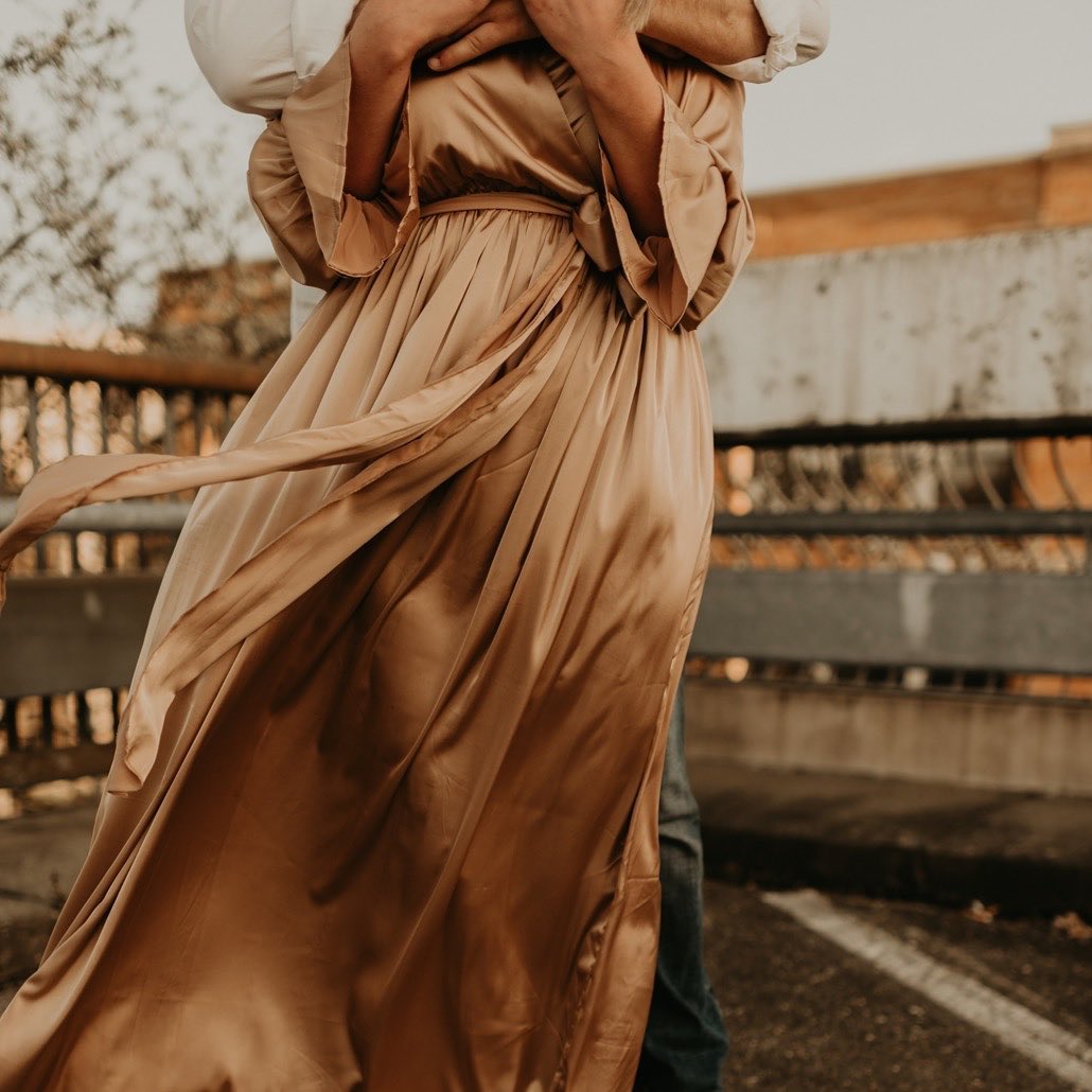
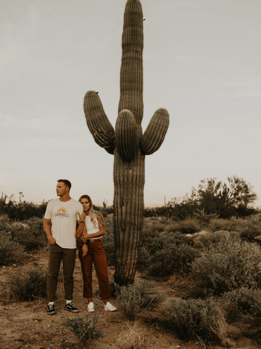
My brand portraits, captured beautifully by Nikki Harris Photography, embody this seasonal story. Set against the backdrop of late fall’s rich palette with unexpected touches of early snow, they capture that extraordinary moment when nature offers both warmth and clarity. The abundant white space in these images wasn’t just fortunate timing – it was nature herself participating in the brand design, offering the perfect canvas for the story.
Beyond First Impressions
the ripple effect…
every detail contributes to a larger love story
This brand development process demonstrates the power of intentional design. Like the wedding industry itself, where every detail contributes to a larger love story, each element of the Purely Heartfelt brand works in harmony to create something greater than the sum of its parts.
Brand Elements: the ripples in a pond
Like a stone dropped in still water, the impact of thoughtful brand design extends far beyond its initial touch point. Each element of the Purely Heartfelt brand works like ripples in a pond, creating waves of meaning that reach out to touch hearts and inspire connections. This isn’t about making a splash – it’s about creating gentle, ever-widening circles of influence that, like the lasting memories of a perfect wedding day, continue to bring joy long after the first moment of contact.
Consider how nature creates patterns: not by force but through the gentle persistence of authentic expression. A snowflake doesn’t try to be beautiful – it simply follows its natural form. Similarly, when you allow your brand elements to flow from genuine purpose and meaning, they naturally create patterns of connection that resonate with those who share your values.
This philosophy has guided Purely Heartfelt’s expansion into new territories, including The Purely Wed and Purely Bridal Shops on Etsy. These aren’t just additional business channels—they’re new streams flowing from the same pure source, carrying the same commitment to authenticity and mindful creation to different shores.


Process Insights for Fellow Creators
This journey reinforced several key principles of mindful brand development:
- Listen to natural wisdom
- Honor authentic expression
- Create space for evolution
- Find meaning in every choice
- Build harmony between elements
Every journey through nature teaches something new if we’re willing to pause and listen. My brand development process has revealed these eternal truths about creating meaningful design:
Listen to natural wisdom
Just as a garden can’t be rushed, authentic brands need time and space to grow. Pay attention to the natural rhythms and patterns that emerge in your creative process.
Honor authentic expression
Like a flower blooming in its own perfect time, your brand will flourish when you allow it to express its true nature rather than forcing it into predetermined forms.
Create space for evolution
Nature teaches that growth isn’t linear. Sometimes, you need periods of quiet reflection, like winter’s rest, before new ideas can burst forth like spring blossoms.
Find meaning in every choice
In nature, nothing is arbitrary. Every color, pattern, and form serves a purpose. Bring this same intentionality to your brand choices.
Build harmony between elements
As in an ecosystem where every species plays its part, successful brands create harmony between all their elements.
The Living Brand
A brand, like nature itself, is never truly finished. It grows, adapts, and evolves with each season. Purely Heartfelt continues to unfold like a flower opening to the sun, expanding through various expressions while maintaining its core essence – the pure joy of creating beauty and meaning in service of love.
Ready to tell your unique story?

unfolding story
